 Shopping Guide
Thanks so much for all your wonderful entries!
After careful consideration, we're happy to announce the contest winners, including the fan voting prizes!
We hope you enjoy browsing the winning submissions and reading the commentary from our panel of judges.

A panel of TOM staff who absolutely love figures (and photos of them!).

HaraPhotographer

MorisawaDesigner

CueDesigner

TajimaDesigner

RachelIllustrator


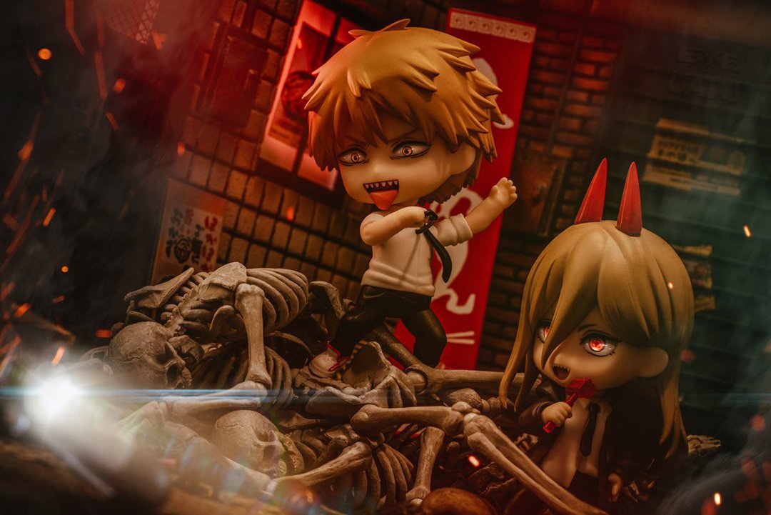
- greenisyelllow
- Submitted via Instagram


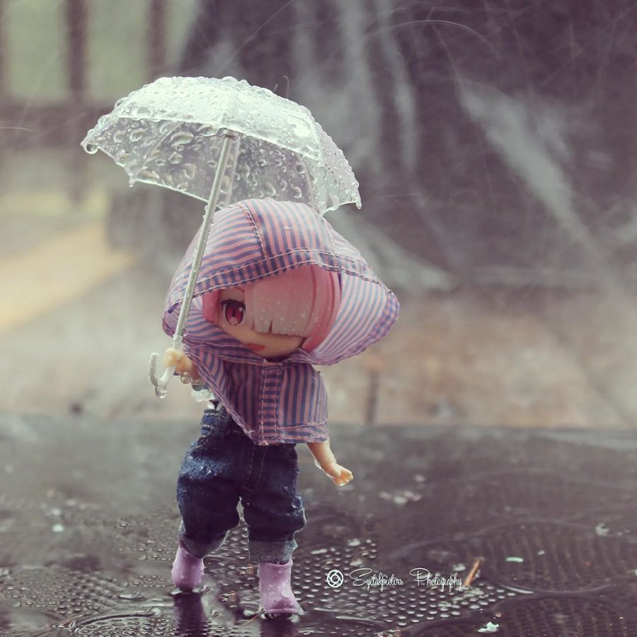
- imlike_t_t
- Submitted via Instagram

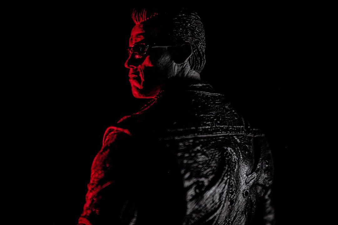
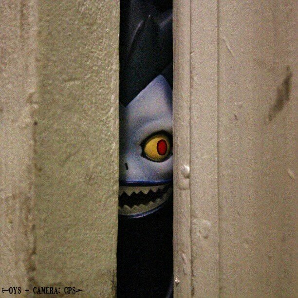
- Hara Photographer
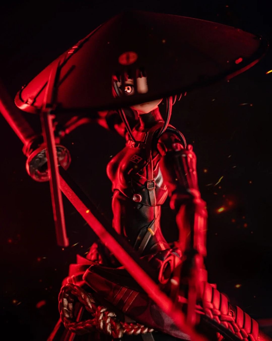
This photo, chosen as the first runner-up, is simple but impactful at the same time. That’s because the level of the author’s photographic technique is high. For example, they know how to control the eyes of the viewers. While filling the screen with red, the focus is on the character’s eye that peeks through the slits in her ripped bamboo hat. By doing so, they provide depth and three-dimensionality to the picture in the eyes of the viewers. Of course, their control of blurring, one of the basics of photography, and the choice of trimming area are also exquisite. Please surprise us again with your next work using your photographic technique!

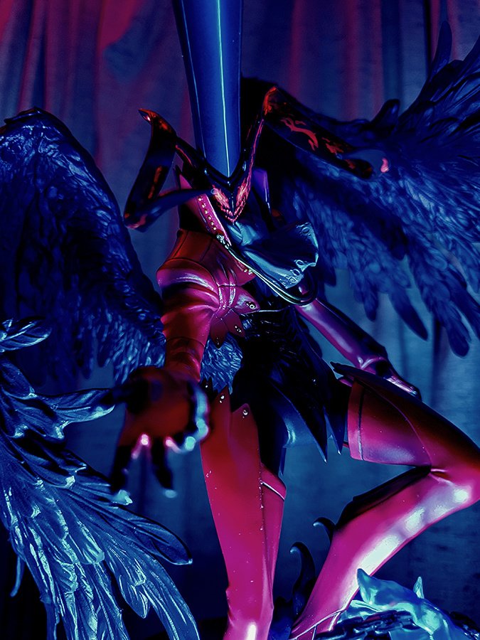
- Morisawa Designer
This photo is memorable thanks to its lighting, staged with the contrast between red and black, and the hostility in Ronin’s eye as she glares at you through the slits in her hat.
It’s hard to control the depth of field in a photo that focuses on one spot in the back, but it succeeds in leaving the details in (her fingers in the front, for example), creating a feeling of tension. Bravo!

- Cue Designer
Ronin, clad in pitch-black armor, is lit up in red like in classic Japanese period movies. Her glaring eye appearing through the slits of her bamboo hat, typical of masterless samurai, drew me in.
The red-filter lighting around the figure is superb, as is the way the focus gives depth to the photo.
Congratulations on being the first runner-up!

- Tajima Designer
Her eye sharply glares at the viewers from the slits in the bamboo hat, and the point of her sword aimed at them as if to pierce them feels powerful.
The color palette of the figure and the use of effects are kept to a minimum, which shifts the focus exactly to what the author is trying to convey. It’s an excellent picture.
Congratulations on being the first runner-up!

- Rachel Illustrator
The idea of this composition, centered on her glaring eye through the hat’s slits, is really cool! The balance between the red light and the black is perfect and masterful. The focus is on her glistening eye, and the lighting and composition provide a sense of tension that the viewers can feel. Congratulations on being the first runner-up!


- Nick Glo
- Submitted via Google Form
- Hara Photographer
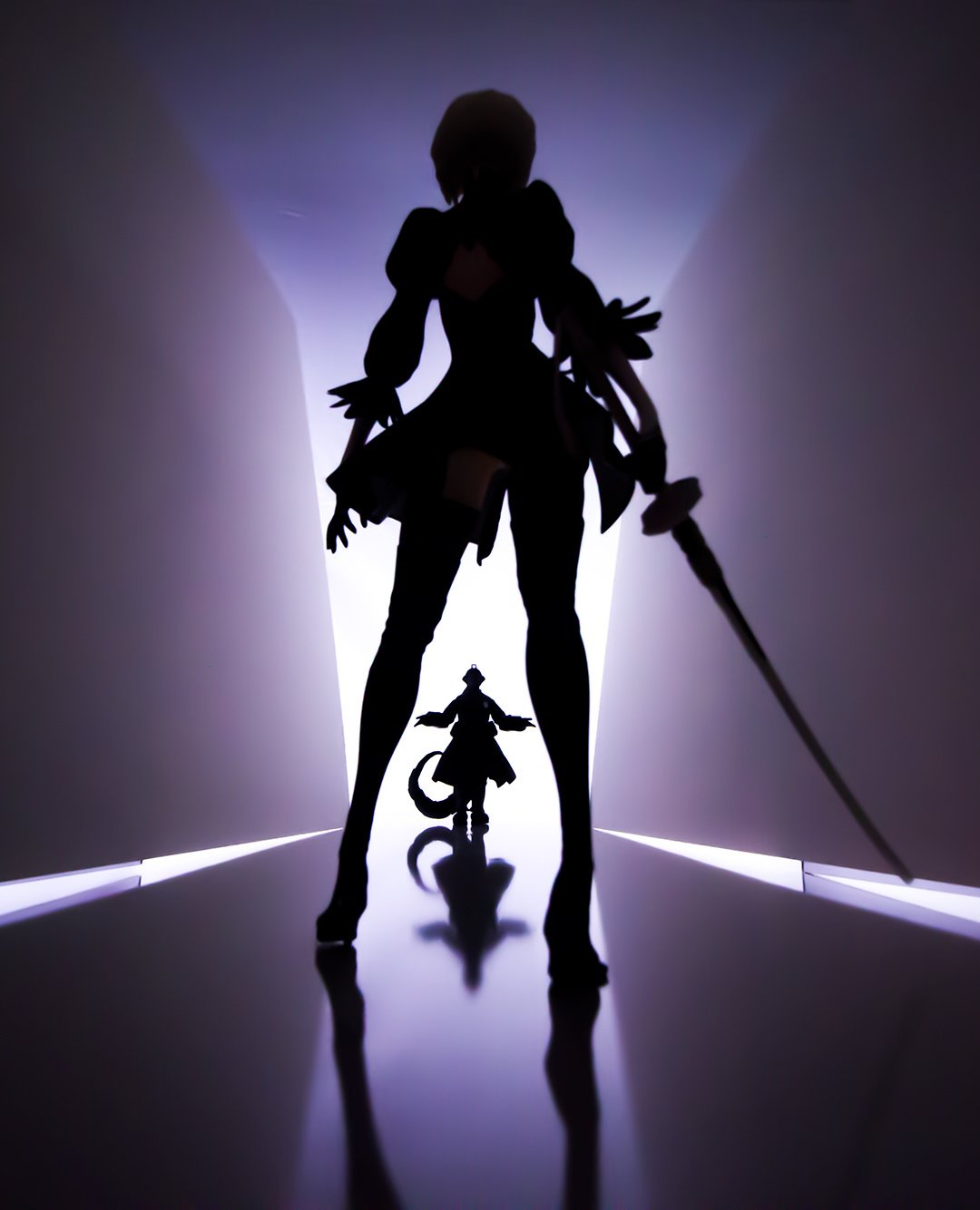
This photo uses radial composition, where the image radiates from one spot, which adds depth and dynamism to the picture. Additionally, turning the subjects into silhouettes with the use of backlight excites the viewers’ imaginations and succeeds in creating a solid story. Looking at this photo thrills the viewers as their imaginations unfold. I think photos that have this effect are excellent works.
- peking25
- Submitted via Instagram
- Morisawa Designer
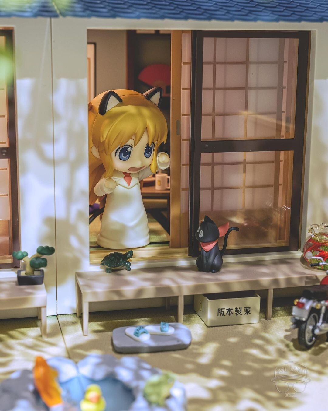
The sunlight filtering through the trees into the garden in this relaxing picture is so lovely. It’s an unreserved (and now rare) snapshot of everyday life, which is just what “Nichijou” means. The triangular composition with the professor’s head as the apex is also splendid. I just have one piece of advice: the bonsai, the motorcycle, the cut-off goldfish bowl, and the blurred things on the front (frogs, perhaps?) feel out of place on the screen. It would be even better to make the picture more balanced by showing things in a meaningful way or removing them otherwise. I’m looking forward to your next submission!
- yamitsuki
- Submitted via Google Form
- [ MyFigureCollection ]
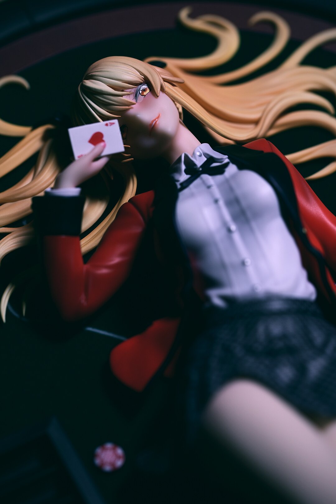
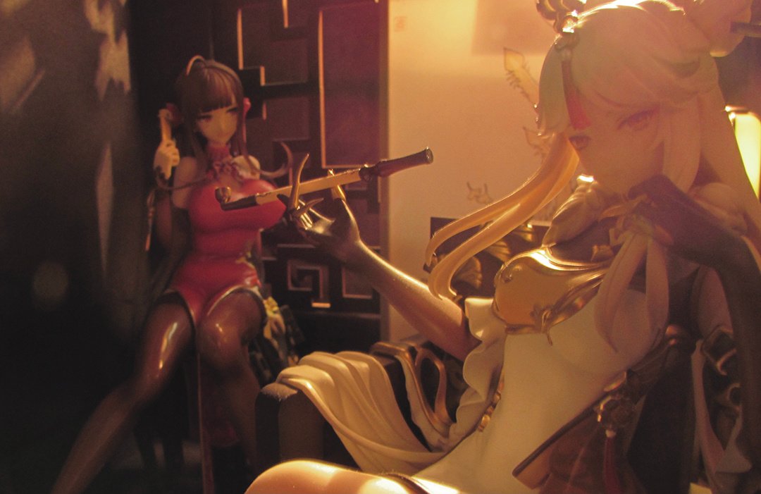
- Cue Designer
The figure used here is of very high quality to begin with, and the image comes to life thanks to the sultry lighting and the trimming showing a glimpse of Mary Saotome’s thigh while focusing on the ace of hearts in her hand.
The figure itself looks up, so not much can be done about it, but the photo would have stood out even more if she were looking at the camera.
- @keeps_by
- Submitted via Twitter

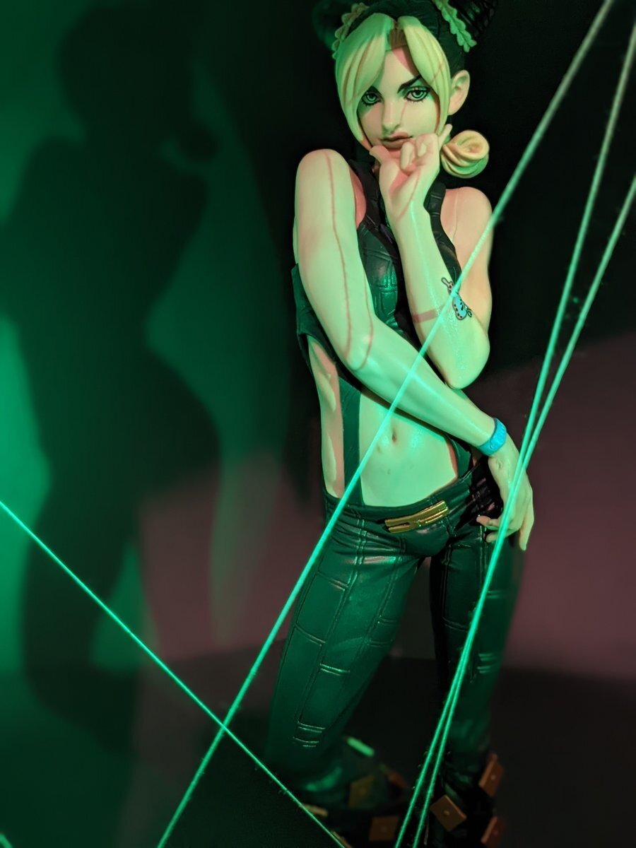
- Tajima Designer
This work is impressive for its use of shadows, such as the threads’ shadows on her skin and her silhouette on the wall. It’s sexy and mysterious, and it has a charm that draws you in despite being simple.
I appreciate how the author was able to pull out the figure’s potential to the max.
Congratulations on being selected!
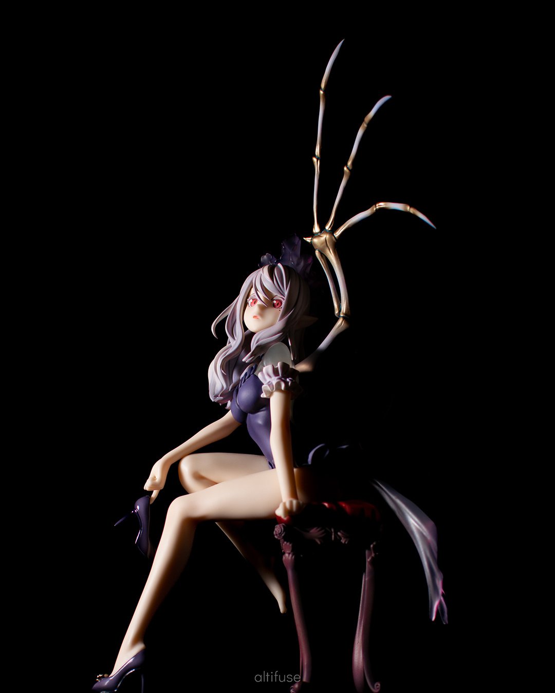
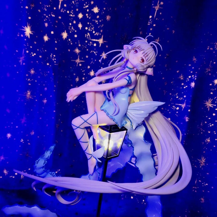
- altifuse
- Submitted via Google Form
- Rachel Illustrator
I was attracted to the beauty of the figure's presentation, which looks like a statue illuminated in the darkness. The skillful composition has a direct beam of light flashing over the figure sideways, which makes the frames of her legs, face, and wings stand out. I love more than anything how the lighting makes the beauty of her bones pop. This photo packed a punch simply with its lighting and composition that enhances the beauty of the figure’s silhouette in the darkness, and that’s really cool! Congratulations on being selected!


- _phototoys
- Submitted via Instagram
- @AhabXII
- Submitted via Twitter
- @EyeOfUatu
- Submitted via Twitter
- eyetakpictors
- Submitted via Instagram
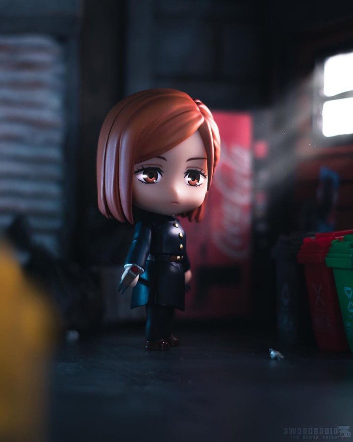
- swordoroid
- Submitted via Instagram
- boop_bopt
- Submitted via Instagram
- bucenian22
- Submitted via Instagram
- figura4official
- Submitted via Instagram
- figuremaniashow
- Submitted via Instagram

- @animefigurestoysnmore
- Submitted via Google Forms
- alecguinn
- Submitted via Instagram
- cpsv
- Submitted via Instagram
- Isaiah DV
- Submitted via Google Forms
- lilshallot
- Submitted via Instagram
- Michael Marquez
- Submitted via Google Forms

- Cozmicninja
- Submitted via Google Forms
- Nyx M
- Submitted via Google Forms
- peking25
- Submitted via Instagram
- satoshi__k
- Submitted via Instagram

- selfishpancake
- Submitted via Google Forms


Need more ideas to get you started? Follow us on Instagram!
Tokyo Otaku Mode Instagram
We showcase stunning figure photos from all over the world (only with permission, of course).
Every month, the photographer behind one featured image is selected to win $10 in TOM Points.
Once the Figure Photo Contest results have been announced, your entries could get specially featured & win points, too.
Follow our account and keep tagging your figure photos with #tomsenpainoticeme for more chances to get featured in the future, even after the 5th TOM Figure Photo Contest officially comes to an end!


Itching to improve your figure photo-taking skills?
Get a leg up with expert advice from TOM’s staff photographers!


Plus, for TOM Premium members only:
enjoy a special peek behind the scenes of a previous figure photo contest,
including a Q&A with one of our judges, as well as a few special words from the Grand Prize winner!
Premium Exclusive Article
Let's Talk about the 2nd Figure Photo Contest!
A look back at the stories behind the TOM's second ever Figure Photo Contest!
Learn a few tips on what it takes to produce a winning submission!
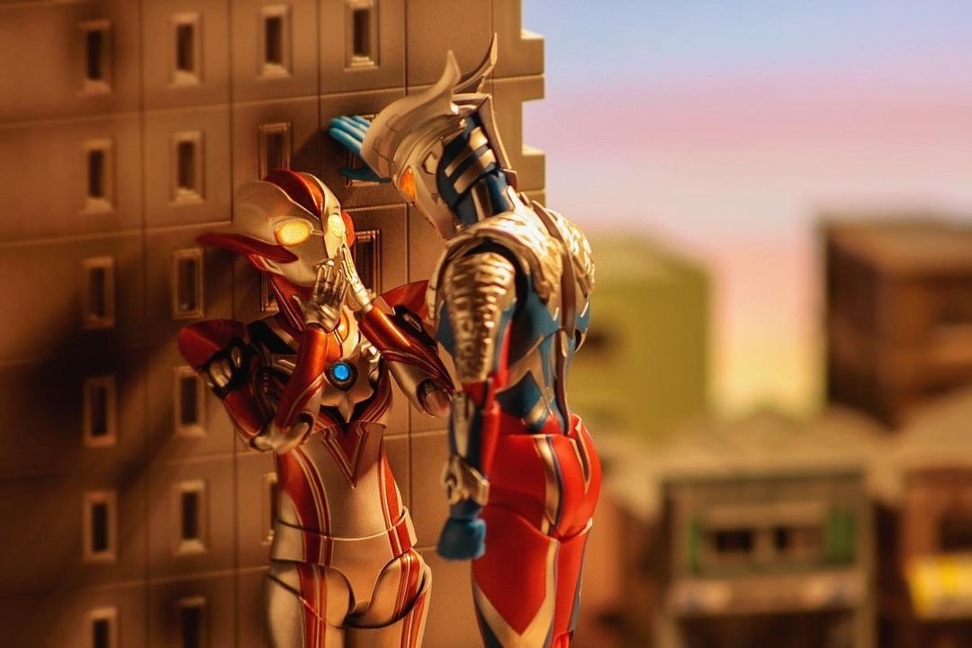
All judges unanimously awarded the grand prix to this fantastic picture that combines an original idea with great technique. The charming humor of this photo will make everyone who sees it giggle, but it still feels somewhat real. Not only can the viewers infer its backstory and situation, but they can also feel the characters’ breaths, warmth, and heartbeats. That is why this photo was chosen for the grand prix. It doesn’t stop here: the author’s fidelity to the basics of photography was also a crucial factor in our evaluation. They used the rule of thirds, which is the basis of composition. The picture looks very stable, and the photo’s brightness, color temperature, contrast, and saturation are very natural. I can’t wait to see your next picture! Congratulations on winning the grand prix!
This photo was much talked about by the jury. It amplifies the “kabedon” trope (in which a man pins a woman to the wall in a romantic setting), so we called it “building-don”! At first, we laughed at how funny it was, but the dusk atmosphere with their shadows projected on the building, paired with Zero’s impassibility and Grigio’s expression (or whatever it is) as she blushes (or looks like she’s blushing) slowly turned it from a funny photo to a snapshot of melancholy, emotional teenage love.
The low-rise buildings in the background on the right and the camera’s position were meticulously staged, and it’s remarkable how the Ultramen’s giant size comes across correctly.
Congratulations on winning the grand prix!
Ultraman and Ultrawoman’s giant-scale kabedon, or better, building-don!
That was already enough to steal our hearts, but the color of the light at dusk, the scenery with their long shadows on the building walls, and the dreamy look on Ultrawoman Grigio’s face (despite how hard it is to make figures look expressive) all are stunning.
I’d love to be inside one of those rooms to see how things develop from the window!
The idea of having Ultraman do a kabedon, or better, building-don, is so interesting! The color of the sky at dusk and the dramatic lighting make this a gorgeous picture that’s extremely good as a photographic work, as well.
The direction is also fantastic. You can feel the ineffable atmosphere between the two and see how Ultrawoman's heart is throbbing thanks to her pose and the light in her eyes, despite the figure being expressionless.
Congratulations on winning the grand prix!
As soon as I saw this photo, I got excited and said, “It’s a building-don!” It may be a cliché composition, but it’s a fantastic picture that makes full use of the Ultramen’s gigantic size. The buildings in a corner of the city, the shadows in the light of dusk… The atmosphere is perfect! Most of all, I was amazed at how the skillful posing made this such an expressive picture, even though the Ultraman figures have no facial expressions. You can see Grigio holding her breath as her heart races. It’s such a charming photo! Congratulations on winning the grand prix!