Thanks so much for all your wonderful entries!
After careful consideration, we're happy to announce the contest winners, including the fan voting prizes!
We hope you enjoy browsing the winning submissions and reading the commentary from our panel of judges.
A panel of TOM staff who absolutely love figures (and photos of them!).

HaraPhotographer

MorisawaDesigner

CueDesigner

TajimaDesigner

RachelIllustrator
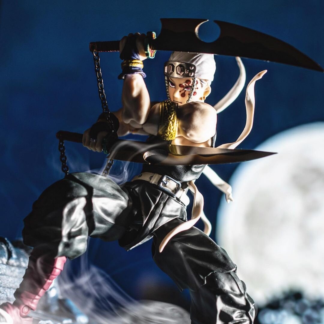
- satoshi__k
- Submitted via Instagram
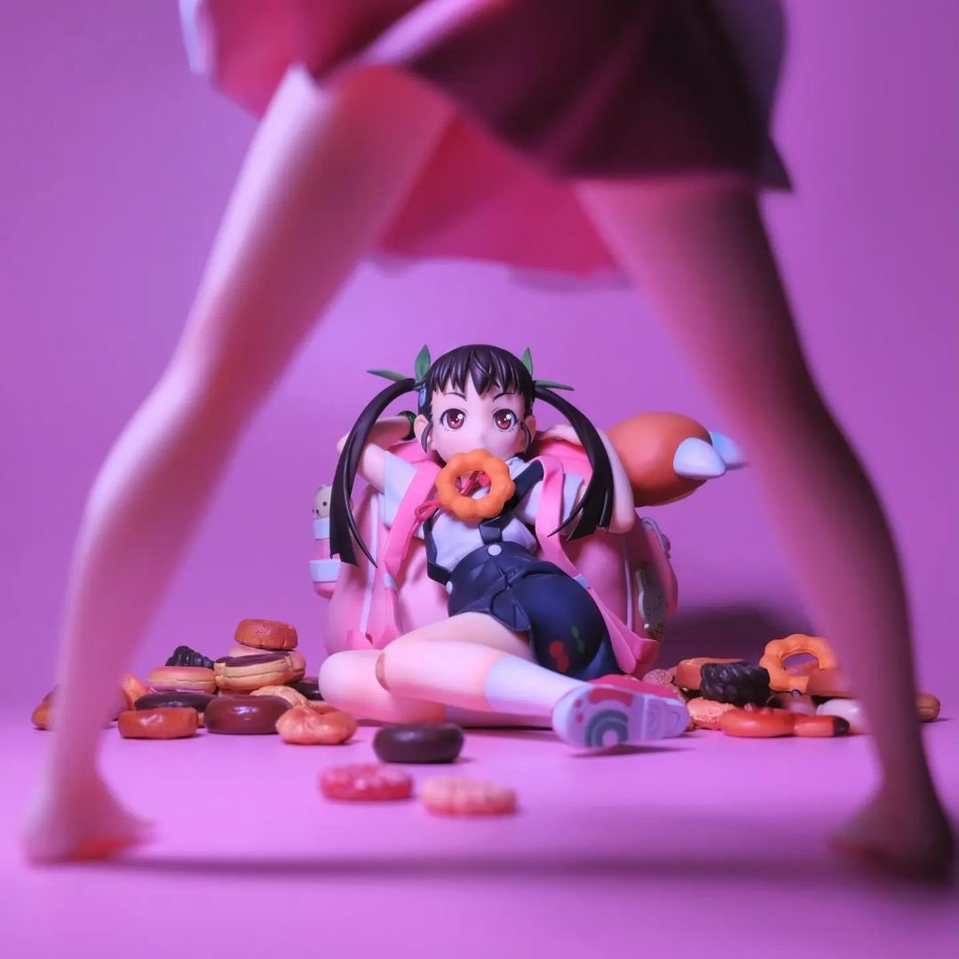
- kyuui.tan
- Submitted via Instagram

- Hara Photographer
This photo stimulated my imagination and has the strength to make the viewer feel the story that unravels before and after. Several questions come to mind, such as, “What’s going to happen after this?” “Whose legs are those?” “How did things come to this?” The shadows brought out by side lighting and the use of triangular composition show a sense of urgency and the characters' feelings, giving depth to the story. Congratulations!

- Morisawa Designer
I guess Hachikuji ate Shinobu’s donuts. Photos with this sort of layout are surprisingly hard to balance, but the ratio of this picture is beautiful and shows precisely what it intends to show while still making the blurred parts easy to understand. The color of the wall and floor are perfectly balanced with the figures’ palettes, indicating that this photo was lovingly crafted in many of its details. Congratulations!

- Cue Designer
It’s hard to pack the animosity these two girls have for each other in one picture, but having the focus go between Shinobu’s legs and land on Hachikuji, glancing up with a donut in her mouth, makes it clear that Shinobu is glaring at her. Plus, the pink background is stylish, like a poster. Congratulations!

- Tajima Designer
This piece drew the attention of the jury because it’s a stylish photo that could be the cover of a fashion magazine or a CD cover. The main color is pink, but it doesn’t make the photo too cutesy, as the gorgeous composition lends an element of coolness to it. The way the skirt in the foreground flutters and how the author swapped the ribbon in Hachikuji’s mouth with a donut shows that they know how to use the figures’ poses and glances to create an image packed with creativity. Congratulations!

- Rachel Illustrator
The palette and the bold composition make this photo as stylish as a CD cover! It’s amazing how the author makes you think, “Wow, she’s mad,” just by showing Shinobu’s legs and fluttering skirt in the foreground. The position of the donuts, the way Hachikuji is shrinking away but still looks up… The more you look at this photo, the more the story unravels inside of your head. Congratulations!

- Hara Photographer
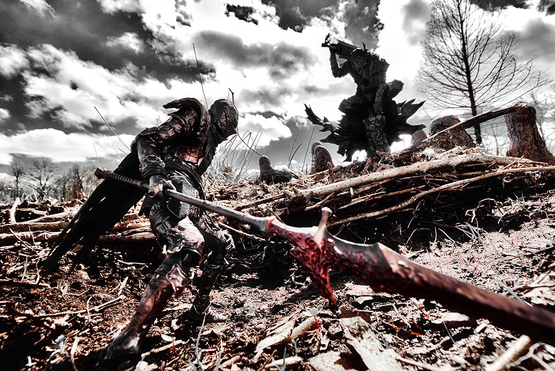
At first glance, the clouds, trees, and ground seem messy, but the use of the basic (yet crucial) rule of thirds naturally directs the viewers’ eyes to the characters. The composition, the cloudy and heavy sky, the characters’ positioning, and the rough terrain combine to splendidly express a realistic world. However, it’s a pity that the characters, who should be the focus, blend in a little too much with the scenery. A more masterful usage of lighting and angles to emphasize the protagonist would have made this photo Grand Prize-worthy. The author’s other entries are also of high quality and have proven their talent in several styles, so I’m excited to see what they’ll come up with next!

- Morisawa Designer
A perfect balance and a diagonal horizon! Clouds that make the screen dramatically pop and serve as saturated linework! Its subdued color palette captures a confrontational moment. This is an epic work. It doesn’t focus on the figure characters themselves but uses them as one of the elements to convey the tension of this showdown. It’s amazing. The other works entered by this author were great, too! I’m looking forward to seeing your next creations.

- Cue Designer
The balance between the sky and the horizon, the clouds that serve as saturated linework, and the composition that makes the viewer’s glance flit from left to right… All of these elements add to the realism and attractiveness in this photo. The subdued color palette expresses a sort of ravaged tension, and it’s amazing. Congratulations!

- Tajima Designer
It’s hard to lead the viewer’s eyes in a wide-angled image, but this picture successfully does so, thanks to its solid composition. The sword in the foreground looks like it’s about to hit the viewer, giving the photo a powerful sense of realism.You can’t see the faces of the figures, but you can still feel the tension as they face off against each other. This takes a great amount of talent and skill. I was pulled into the bleak world of this photo from the first time I looked at it. Congratulations!

- Rachel Illustrator
The balance between the sky and the ground, the speed of the clouds, the explosive situation of them glaring at each other… It’s like an awesome movie poster. The position of the weapon closer to us, blurred just the right amount, is also great. The posing and positioning of each figure show us their clean silhouettes. I wonder where this ravaged, ruined backdrop was shot at. Whether it is natural scenery or a set, it fits the world of the photo to a tee. The other entries by the same author had completely different moods, which was surprising. Congratulations!

- Hara Photographer
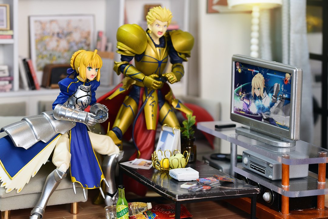
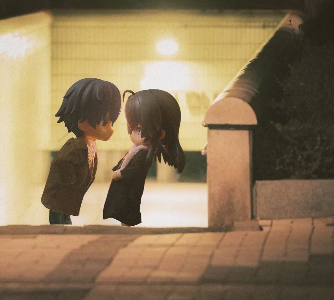
I love photos that look like the author has breathed life into the figures, and this is one such photo. Their relationship, how she’s apparently refusing to kiss him, the dark place without anyone else around… It makes you smile as you imagine what’s going on. It feels like one scene from a movie or a TV show. Technique is necessary to take great pictures, but creative ideas, like the one in this photo, are just as important. I’m looking forward to seeing new works by this author!
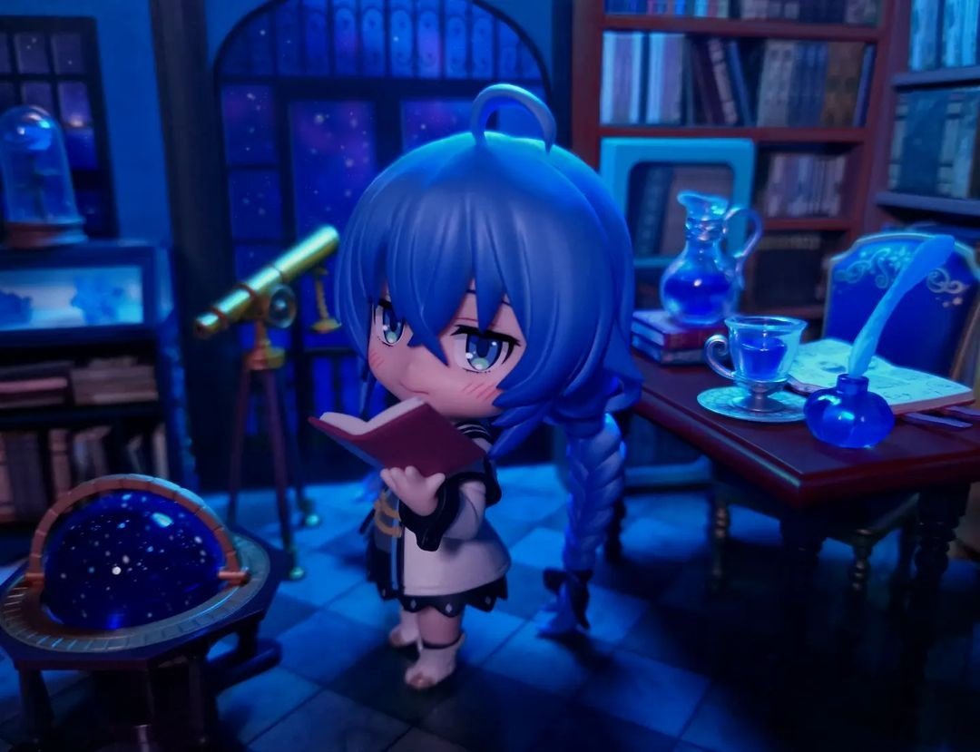
- kyuui.tan
- Submitted via Instagram

- Morisawa Designer
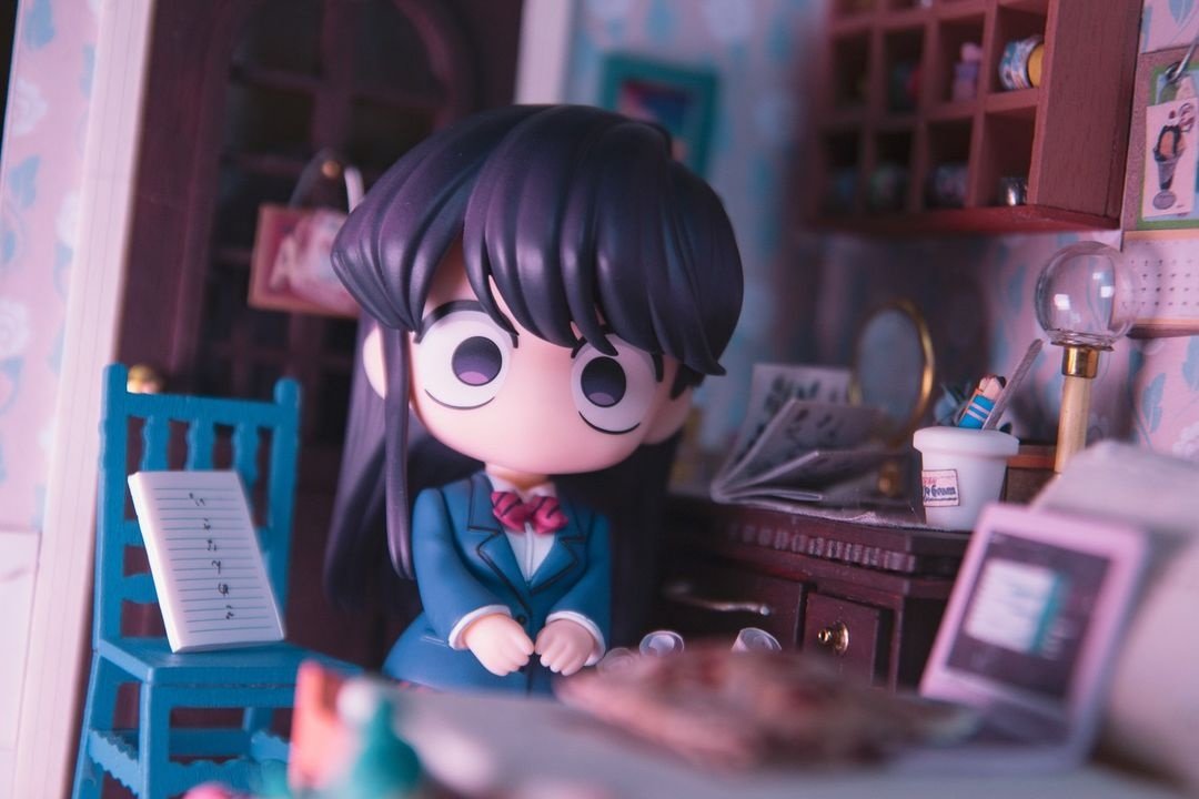
The uniformly blue world of the calm night in this photo is absolutely beautiful. The elements that compose the room and the objects placed in it all serve the purpose of creating a stargazing scene. The shadows brought upon by the lighting and the size of this deformed figure also fit it perfectly! Great job!

- Cue Designer
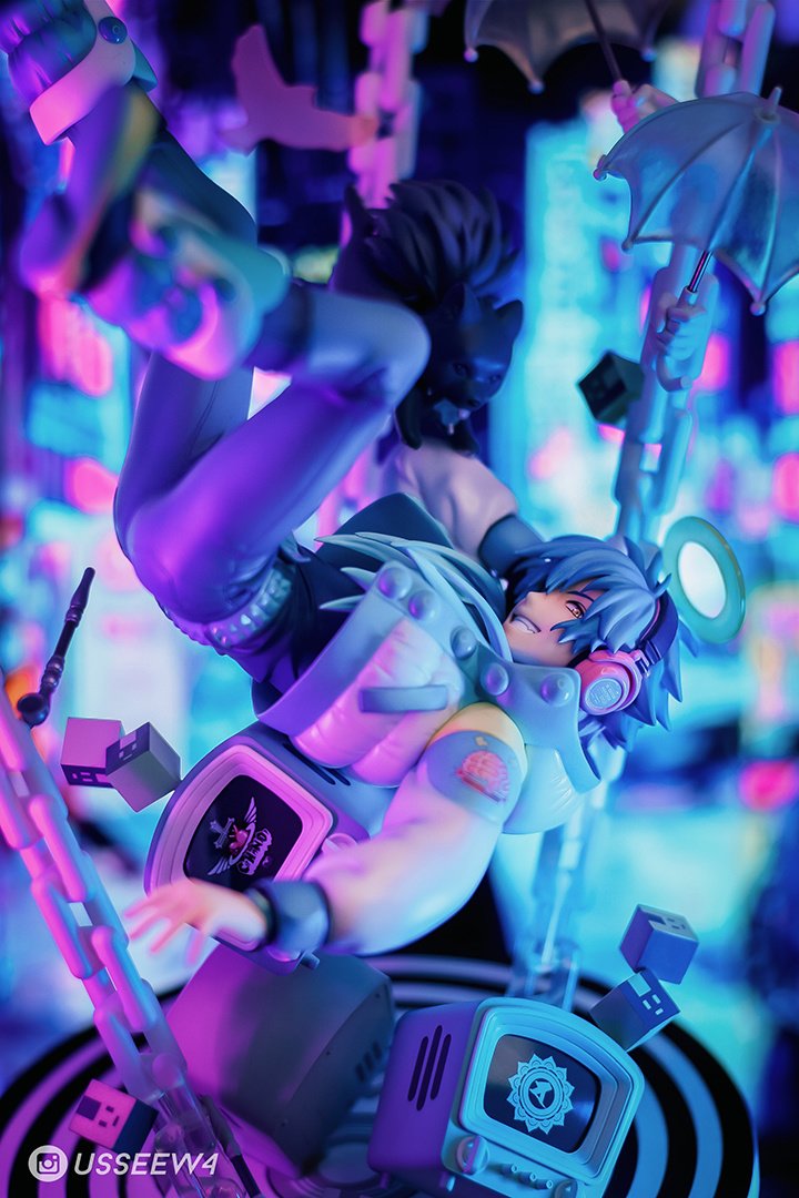
It’s a great piece. The combination of pink and purple lighting with the neon signs in the background makes the way the figure is floating stand out. The focus is firmly on his face, adding impact to the floaty quality of the photo. The author entered several cuts, but I chose this one in which the umbrellas in the top right corner are in the composition.
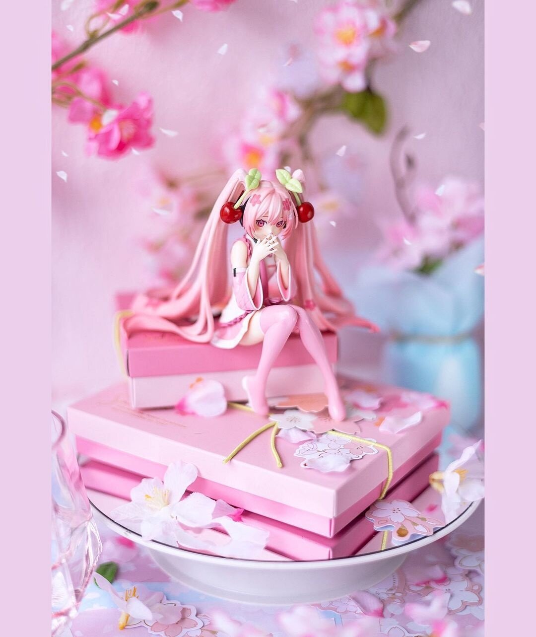
- @koshkinsk
- Submitted via Instagram

- Tajima Designer
Miku is like a cherry blossom fairy and smiles as if she gave us a present. It’s a very heartwarming picture. The main color is a pale shade of pink, but there are light blue accents, and I can feel that the props used have been painstakingly selected. Thanks to its excellent presentation, this piece doesn’t lose to the cuteness of the figure itself. Congratulations!
- haominis
- Submitted via Instagram

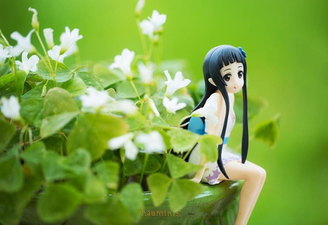
- Rachel Illustrator
The bright green of this photo caught my eye. The balance of Yui’s position lightly sitting on an edge is perfect. The green leaves in the background and the white flowers and dress create a beautiful contrast. It feels like a fantasy world where you find a fairy in your garden! It’s so gorgeous that I’d like to make it into a postcard and frame it. Congratulations!
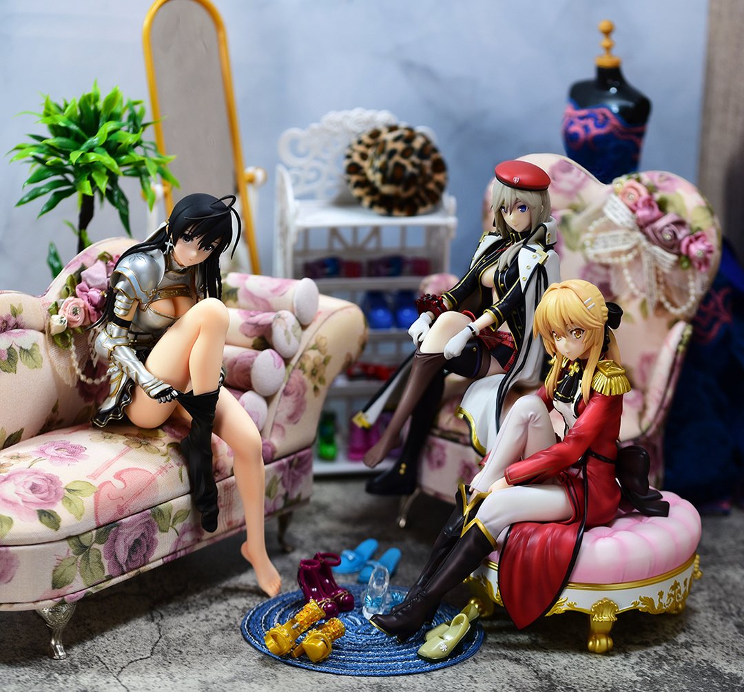
- yamitsuki
- Submitted via Google Form
- [ MyFigureCollection ]

- Vampi
- Submitted via Google Form
- [ TikTok ]
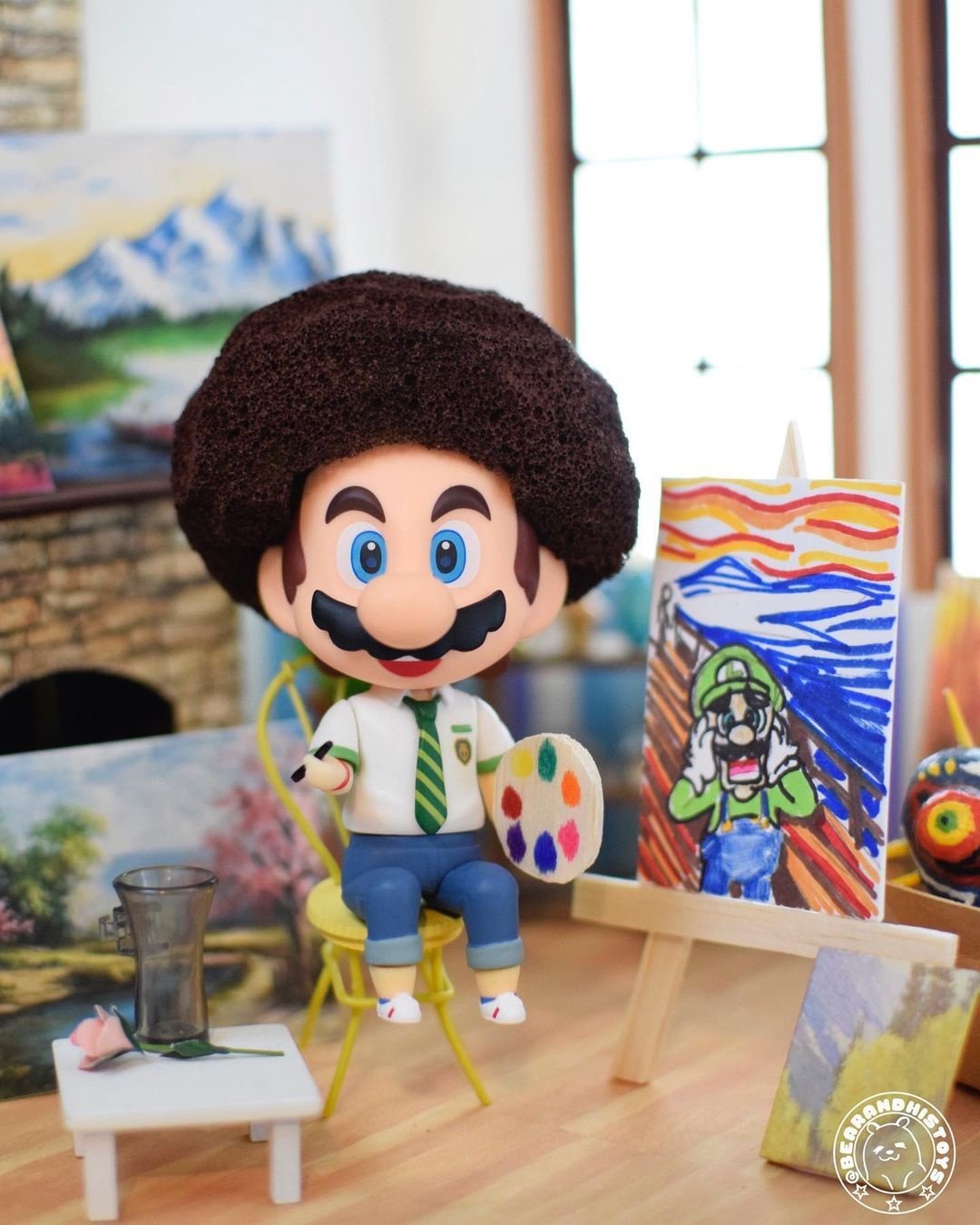
- bearandhistoys
- Submitted via Instagram
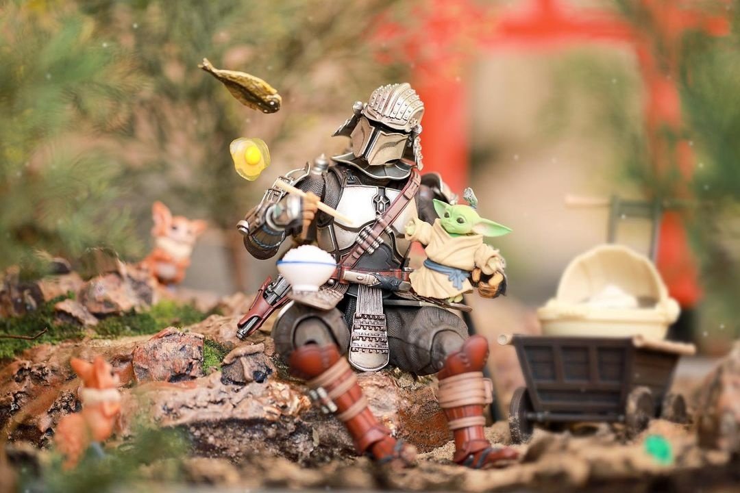
- greenisyelllow
- Submitted via Instagram
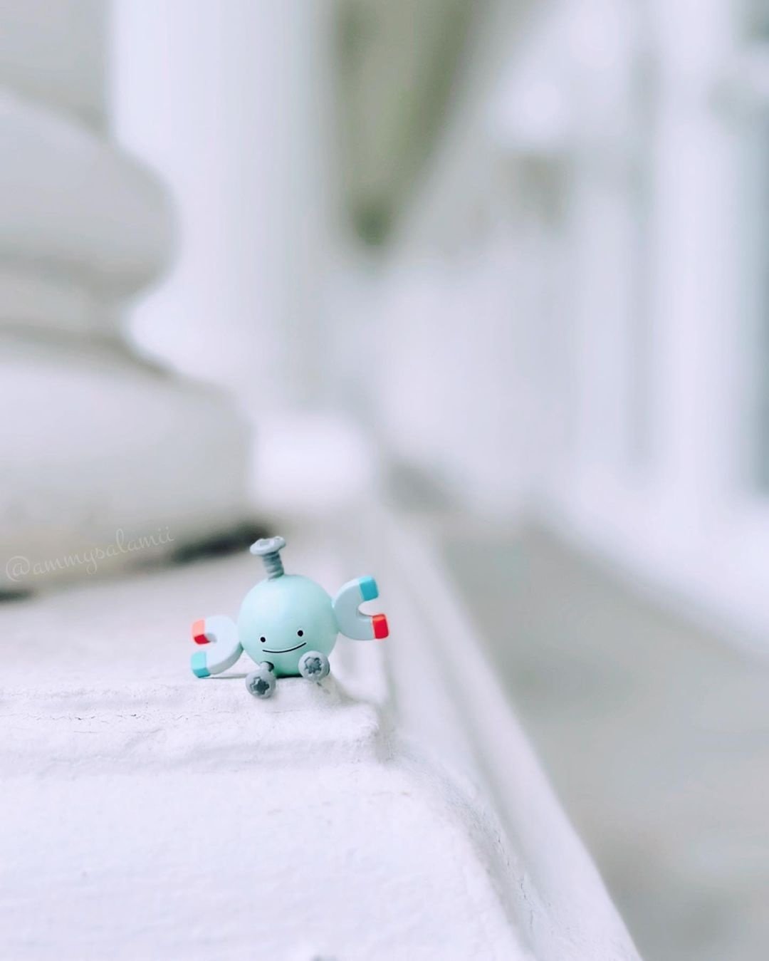
- ammysalamii
- Submitted via Instagram
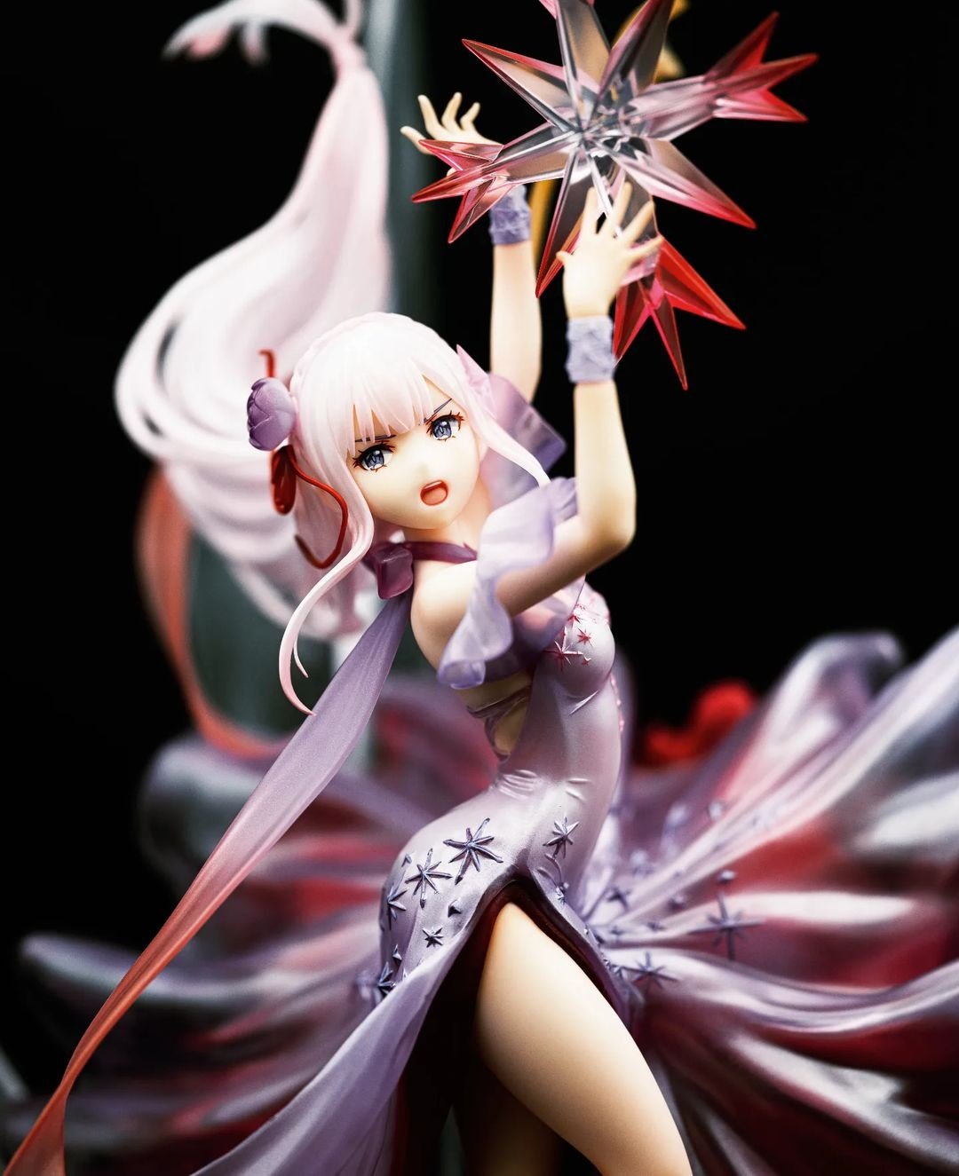
- mira.figures
- Submitted via Instagram
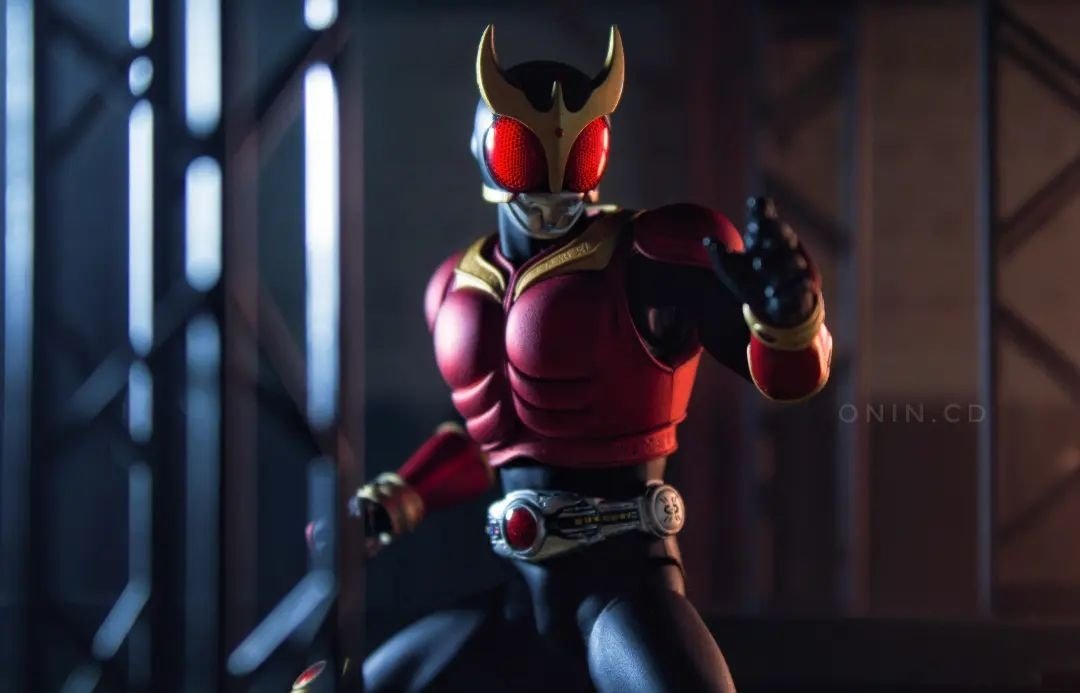
- onin.cd
- Submitted via Instagram
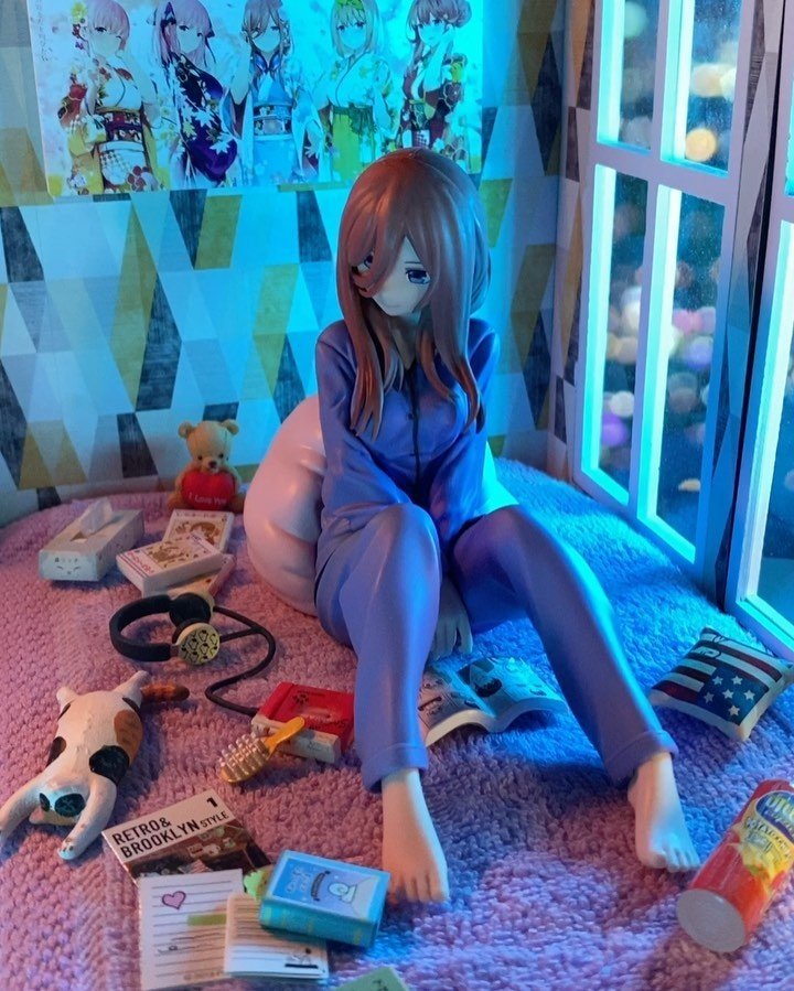
- peking25
- Submitted via Instagram
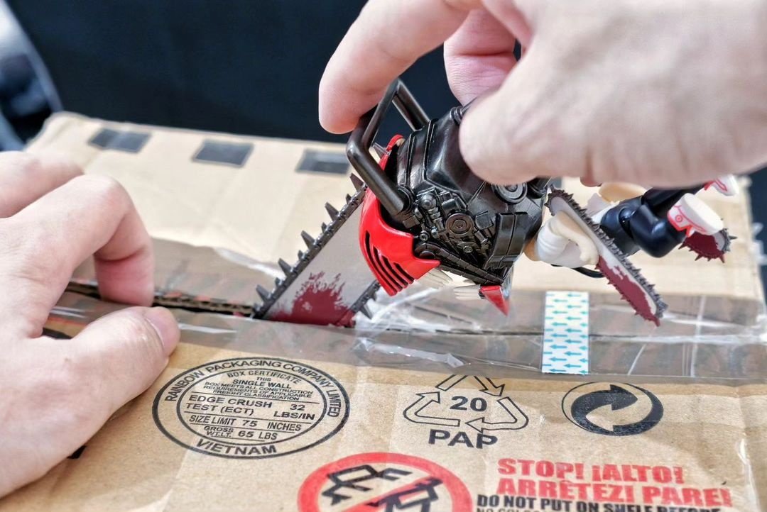
- toys.r.life
- Submitted via Instagram
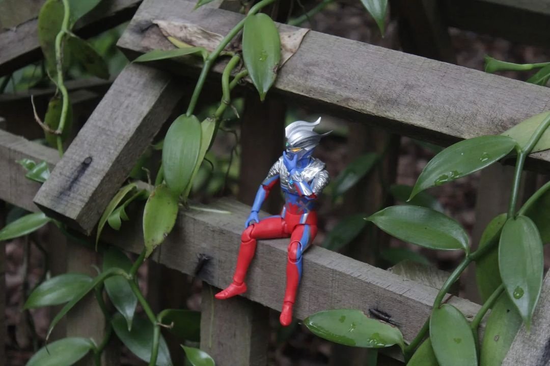
- ultra.heng
- Submitted via Instagram
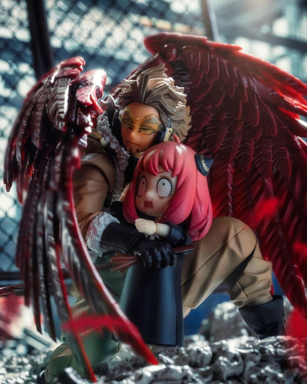
- _phototoys
- Submitted via Instagram
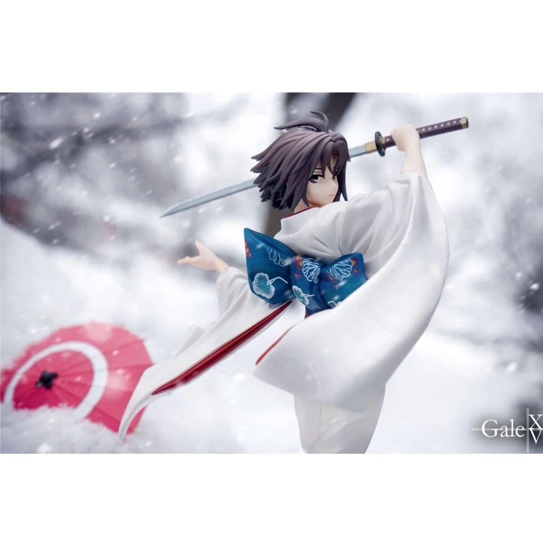
- galexvphotography
- Submitted via Instagram
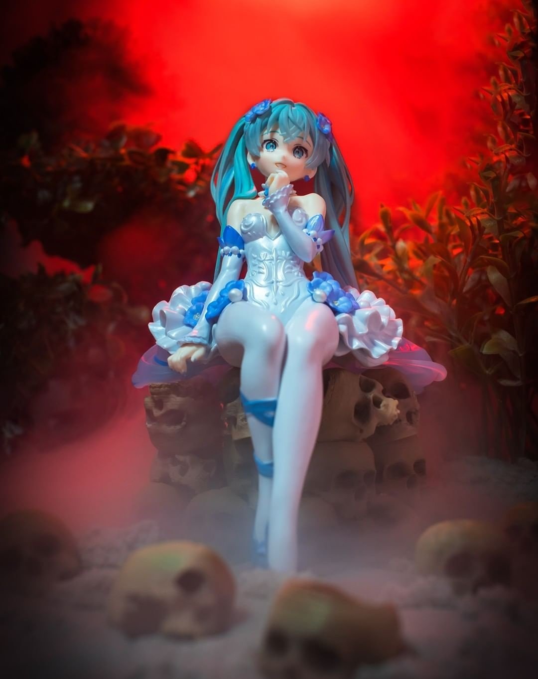
- small.world.official
- Submitted via Instagram
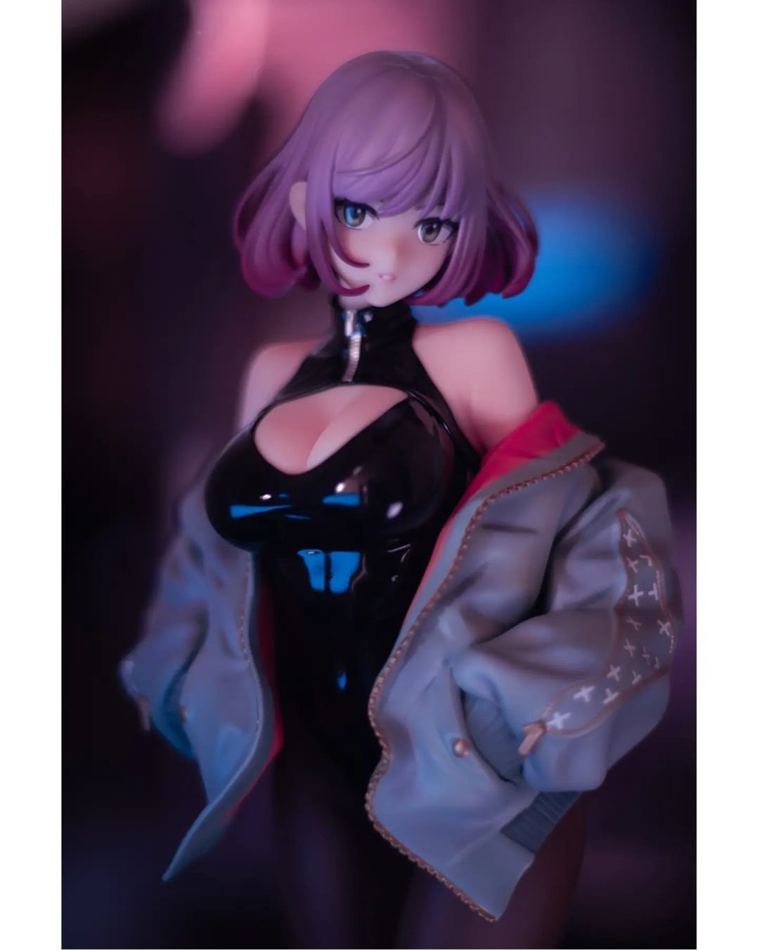
- moribito_c_
- Submitted via Instagram
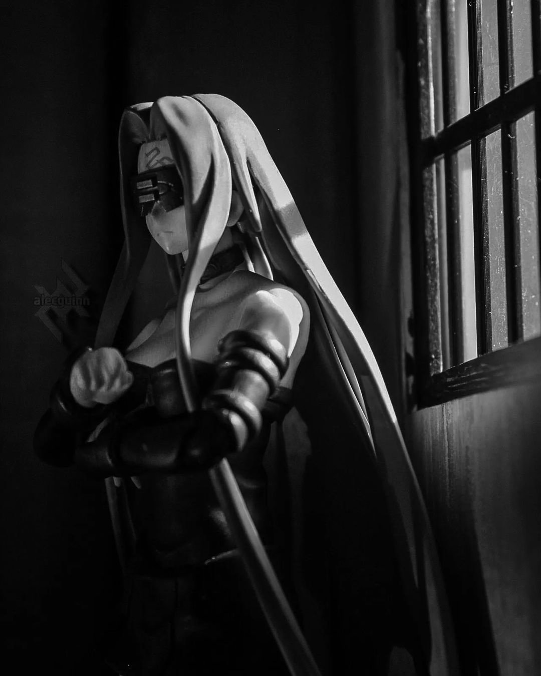
- alecguinn
- Submitted via Instagram
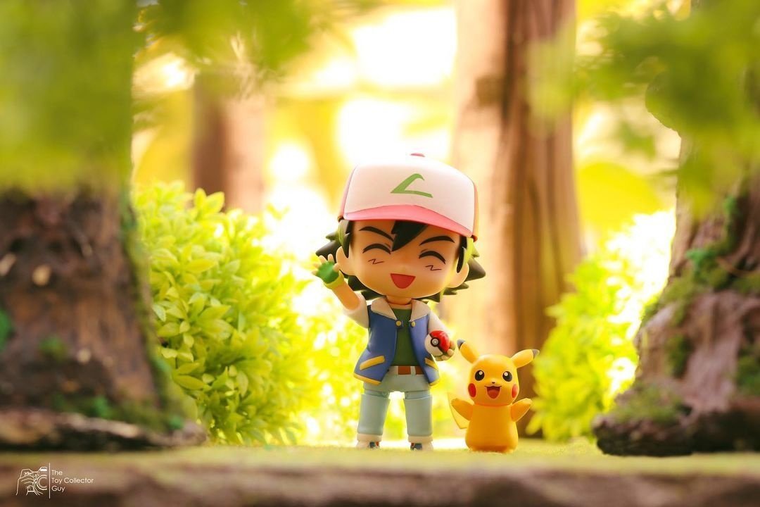
- thetoycollector_guy
- Submitted via Instagram

- ahab_toy_photographer
- Submitted via Instagram
-


- kyuui.tan
- Submitted via Instagram
-

- yamitsuki
- Submitted via Google Form
- [ MyFigureCollection ]
-

- skynendography
- Submitted via Instagram


Need more ideas to get you started? Follow us on Instagram!
Tokyo Otaku Mode Instagram
We showcase stunning figure photos from all over the world (only with permission, of course).
Every month, the photographer behind one featured image is selected to win $10 in TOM Points.
Once the Figure Photo Contest results have been announced, your entries could get specially featured & win points, too.
Follow our account and keep tagging your figure photos with #tomsenpainoticeme for more chances to get featured in the future, even after the latest Figure Photo Contest officially comes to an end!

Itching to improve your figure photo-taking skills?
Get a leg up with expert advice from TOM’s staff photographers!

Plus, for TOM Premium members only:
enjoy a special peek behind the scenes of a previous figure photo contest,
including a Q&A with one of our judges, as well as a few special words from the Grand Prize winner!
Premium Exclusive Article
Let's Talk about the 2nd Figure Photo Contest!
A look back at the stories behind the TOM's second ever Figure Photo Contest!
Learn a few tips on what it takes to produce a winning submission!

 Shopping Guide








This photo is full of energy and stands apart from the other works, so I had no doubt when I cast my vote. The moon behind Tengen Uzui is portrayed with detailed lighting, creating shadows and telling a story filled with a sense of urgency. The composition, trimming, and color palette are spectacular, as well as the use of the smoke effect. I can see how meticulously this wonderful picture has been planned, down to its most minor details. Congratulations on winning the Grand Prize!
The confrontational attitude (even though we can’t see his opponent!) and complete concentration of Tengen Uzui fighting on the roof come across thanks to the shadows on his muscles, lit by the moonlight, and his legs firmly stepping on the ground. This photo makes the best possible use of the charm of action figures. Congratulations on winning the Grand Prize!
The strength of Tengen-sama as he faces a demon, glaring at it under the moonlight, pulled me into the picture. His left foot is trimmed out of the photo, yet you can still tell he’s on an unstable rooftop. What a wonderful piece. Congratulations on winning the Grand Prize!
The composition, the lighting, the figure's pose, and the coloring were all chosen with precision, creating a perfect photo. Tengen-sama is looking at an unseen demon in a confrontation loaded with tension. The articulations of action figures tend to stand out because of how they’re made, but that doesn’t feel unnatural in this photo. Rather than livening up the image, the smoke effect is limited to making the air lightly whoosh, which is extremely effective. The chilly night atmosphere is also perfectly staged by the moon peeping on the right side of the photo. Congratulations on winning the Grand Prize!
The composition snugly fits into the square, and that pleases the eye. Tengen’s eyes convey the tension of the scene. The moonlight casting shadows on his body feels natural, showing an amazing talent at posing and lighting that the entire jury was impressed with. The effects are kept to a minimum, maximizing their efficacy, and the position of the figure and the entire composition are calculated to the smallest detail, making it a perfect, wonderful photo. Congratulations on winning the Grand Prize!